With a variety of color options available to us, selecting a single color can appear to be a difficult task. To sate your need for color, you can always opt for a combination of two colors in your bedroom interior.
Each individual color can influence the inhabitant of a space to experience a certain emotion. For instance, blues and greens tend to invoke feelings of calmness and serenity, while warmer colors like reds and browns are colors that add warmth and coziness, and are good for active zones.
Since bedrooms are usually spaces that you want to be relaxing, the colors you select should be based on this basic understanding of color psychology.
In the sample interiors below, you will see a number of color combinations used in bedroom spaces, from lighter, more subtle colors, to ones that are bolder and tend to dominate a space.
You will also see different configurations in which colors can be applied to your bedroom walls.
By the end of this article, you should have a pretty good handle on how color selection can be carried out for your bedroom interior, and what you can hope to achieve as a final result.
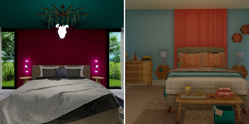
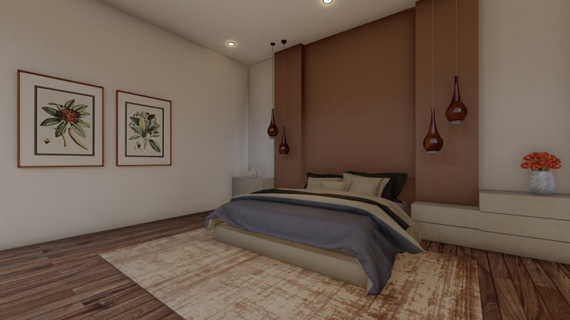
Burgundy and Teal
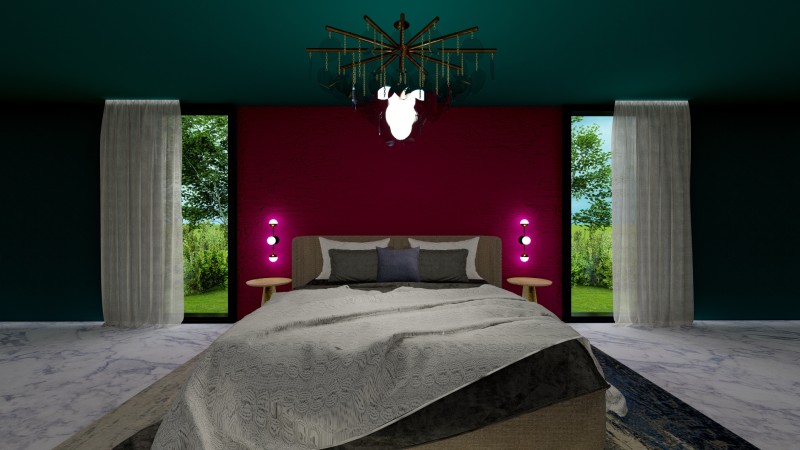
Burgundy is a deep color, a mixture of purple and red. It leans to the warmer end of the color spectrum. Teal, on the other hand, being a combination of blue and green, hails from the cooler end of the spectrum.
The two colors are pretty much the inverse of each other, and as a result they create a delightful contrast when set against each other. Both colors have a rich, velvety appearance, and they add an ornate, luxurious touch to your bedroom interior.
The overall effect is to create a space that appears warmly ensconced in its sheath of color. To build upon that, the teal color has been extended to the ceiling as well. This is a good technique for especially large rooms as it makes the space appear more intimate.
I recommend including gold or bronze accents for your bedroom. For instance, the bronze lighting features stand out against the teal backdrop as a focal item.
Gray And Dull Red Brick
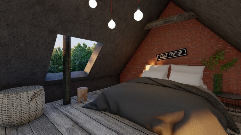
Red is a color that when used in interior spaces induces strong emotions for the user. Its stimulating effects might at first seem to render it unsuitable for use in bedroom interiors, but then there are a number of ways you can soften this effect.
By introducing a red color in the form of a brick finished wall, the color attains an element of three-dimensional area.
The texture of the brick adds a touch of character to the wall surface. Paired with a gray concrete textured finish, the two materials work together to create an industrial aesthetic.
Add indoor plants, and soft bed linens to add a touch of softness to an otherwise industrial looking space.
These kind of wall finishes are a good example of how color need not come exclusively from paint, but can also be incorporated through the use of various wall finishes and textures.
Terracotta Red and Cream
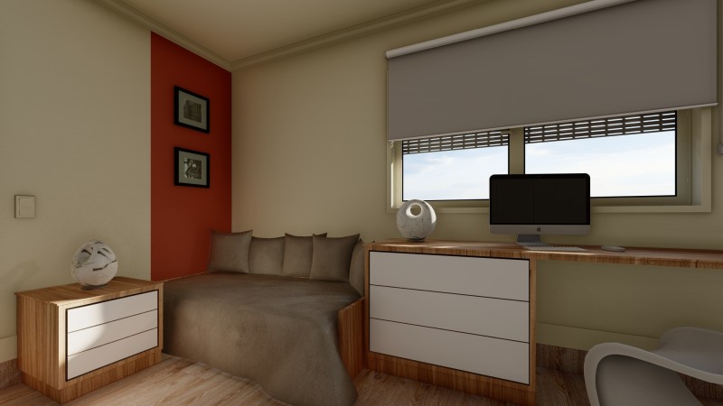
When using a stimulating color from the warmer end of the spectrum, like terracotta red, you will want to use it wisely, so as to avoid making a bedroom interior that fails to help you relax and unwind at the end of the day.
A great way to balance the effect of the terracotta color is by pairing it with a neutral color, like a cream white. Neutral colors are ideal for use in bedroom interiors. They help to relax and unfocus your eyes, they reduce visual stimuli and create a calming space.
In the sample image, rather than a full wall, only a small segment of it has the terracotta color applied to it. This is an example of how you can use color placement to signify different zones of activity in a single space.
Red, being a color that promotes activity, has been placed in an area dedicated for work and study, where its effects will be put to their best use.
To allow the color to remain a point of focus, the use of competing visual elements has been reduced by maintaining the remaining décor in a palette of neutral whites and grays.
Navy Blue and Gray
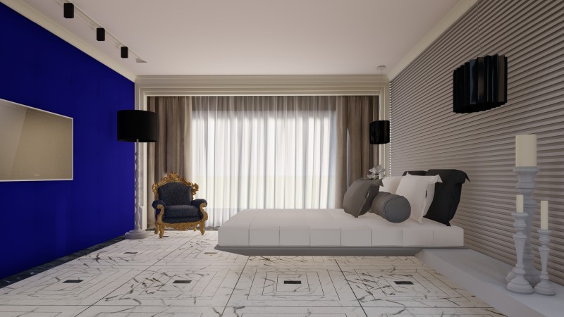
Blue in all its hues is one of the best and most popularly used colors in a bedroom interior, owing to its tendency to create feelings of calmness and tranquility.
When used in a darker tone like navy blue, it can be paired with a soft gray to tone down the overall effect of the color on your space.
A navy-blue color, already being rich and velvety in its appearance, can be further enhanced by incorporating it as a padded wall in your bedroom. The plush appearance of the wall surface adds a layer of depth to the color, making your space appear more luxurious.
The gray wall too can be done in a contrasting texture of sleek, straight lines. In this way, not only do the colors contrast with each other, but the textures too. The combination of the two adds a sense of balance to the bedroom space.
To avoid overcrowding the space with color and texture, the floor and ceiling surfaces are kept to a plain, neutral white. This also serves to brighten and visually expand the space.
Pale Blue and Coral
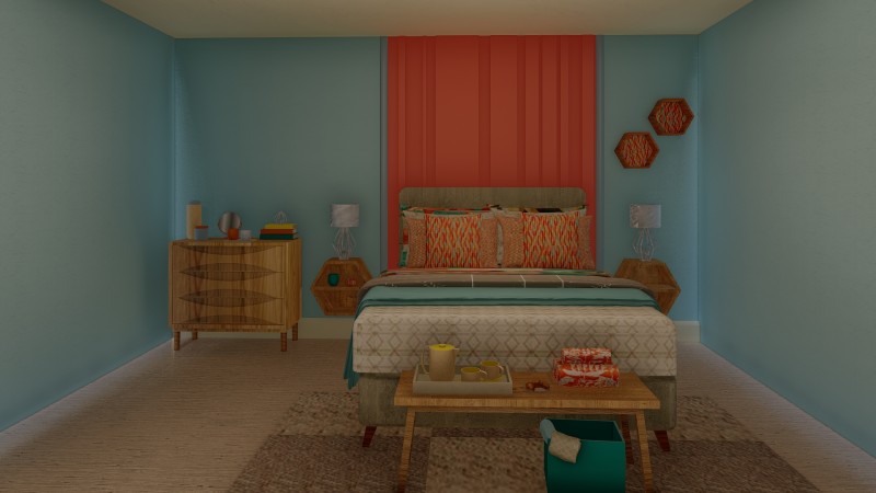
A tranquil color like a pale, powdery blue when used in an interior space can be uplifted by adding a touch of a bright vibrant color like coral. The cooler undertones of one will create a delightful contrast with the warmer undertones of the other.
When one color stands out in such stark contrast to the other, this is a situation where you can use the resulting contrast to create a feature wall that becomes a point of visual focus in your space, directing attention towards it.
I recommend adding touches of the color in your additional décor so that it doesn’t seem like too much of an alien intrusion in the space. For instance, in the sample image, the cushion fabric has a touch of coral, thus extending the color from the wall to the rest of the space.
The presence of the feature wall will dictate how your furniture placement is carried out when you’re setting up your bedroom. This is because a hierarchy has already been defined, and this creates a template that dictates the bedrooms layout.
Tan and Beige
For bedroom interiors, it can be best to reduce visual stimuli as much as possible. This means that bright colors and sharp contrasts can take away from the restful atmosphere a bedroom should be able to provide.
This is especially true for smaller bedrooms with no other function assigned to them. To create the most restful space possible, you can adhere to a palette of neutral colors for your space. Hues of beige or brown can create an effect of softness.
In the sample interior the tan and beige of the walls create a monotone color palette. Here, the difference of hues from a darker tan to a lighter beige add direction for visual focus while maintaining a restful atmosphere.
A palette of tan and beige also appears very rustic in its aesthetic, with the use of earthy color tones. This earthy aspect only enhances the soothing state of the bedroom interior.
Sage Green and Ivory
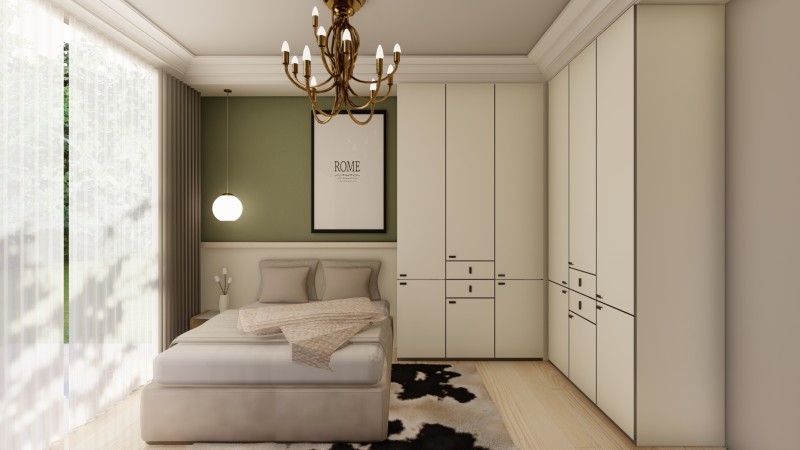
While blues and greens are known for adding an atmosphere of tranquility to a space, even that effect can be enhanced by using muted tones of that color instead of more vibrant ones.
In this sample interior, a sage green color adds a subtle touch of color to an otherwise neutral, ivory-tones interior space. The soft appearance of both the colors extends into the rest of the space, creating a comforting and relaxing aesthetic.
A sage and ivory color palette adds a touch of class and sophistication to your bedroom interior. Additionally, a bronze chandelier further contributes to the classy décor scheme of this bedroom interior.
I recommend that you add sheer white curtains that allow diffused sunlight to filter into your bedroom space, creating an evenly lit, ambient space.
Mint and Powder Pink
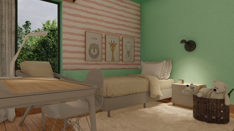
A mint toned wall finish appears at once both soothing and refreshing. The cooler undertones make it a relaxing color to include in your bedroom space while the vibrance of the color ensures that the space never dull and morose.
Paired with a pastel shade of pink, the overall result is playful, soft, and soothing. You can incorporate pink in the form of a patterned wallpaper, if you shy from creating blocks of color.
Plush accents, like a shaggy cream rug, neutral colored bed linens and curtains, and stuffed toys, contribute to the softness of the color scheme.
I recommend this color scheme for children’s bedrooms especially. It is playful and simultaneously relaxing, thus being suitable for playtime and bedtime both.
Related Posts
- Comparison of Duvet vs Quilt vs Blanket: Cozy Bedding Explained
- Pros and Cons of Electric Blankets and Safety Guide
- Comparison of Murphy Bed vs Sleeper Sofa For Your Home
- Different Types of Doors for Closets – Design Ideas with Pictures
- White and Gold Bedroom Design Ideas With Unique Photos
- What Color Bedding Goes With Grey Walls? – Here Are Some Great Ideas
Leave a Reply