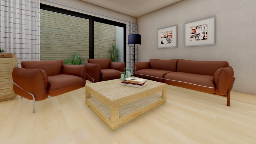
A darker and wear resistant color like brown is a popular choice for fabric upholstery for any area of the home. Brown in all its shades and hues exudes a sense of comfortable warmth, contributing to an inviting and cozy atmosphere for your interior space.
While brown can sometimes be perceived as a dull color, it can be enlivened by pairing it with an appropriate color wall palette.
Depending on the undertones present in a particular shade, it can be paired with wall colors from any end of the spectrum to create an interior design scheme that is aesthetically beautiful, and functionally sound.
In the article to follow, you will see a number of sample images of custom designed interiors that display the use of wall color alongside varying shades of brown furniture.
These images will help you to envision the kind of results you can hope to achieve when applying a certain color to the walls of your room.
BEIGE
A classic color combination of beige and brown presents an interior environment that exudes warmth. The subtle warm undertones of both the brown furniture and the beige walls work together to create an atmosphere of comfort that invites the inhabitants in.
A beige backdrop is one of the safest options available in terms of colors, as you can rest assured, it will complement nearly all colors set against it. As a neutral tone, beige tends to soften the overall look of the interior by providing a sense of visual relief.
I would recommend keeping the remaining décor understated in a minimal palette of black and white, with small touches of color that keep from overpowering the space. In the sample image, you can see a set of lightweight curtains in a monochrome print, and a slender black lamp with a complementary lampshade.
The overall result of this look is understated while still exuding warmth and comfort. It is ideal for living room interior, especially larger spaces where the warm color palette will prevent it from appearing too unapproachable.
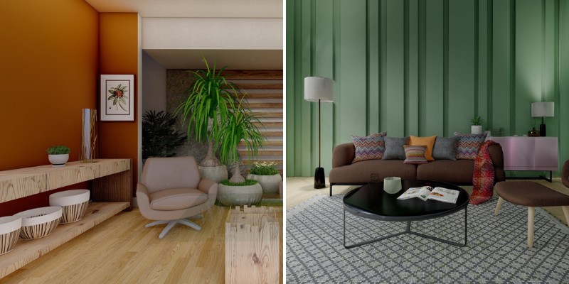
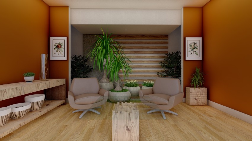
BURNT UMBER
For a lighter shade of brown like a sand or tan color, you can choose to opt it with a brighter, more vibrant color.
As the brown of the furniture segues into the color palette of neutrals, it leaves room for a more eye-grabbing color to bring life and vitality into the interior space.
A lively color like burnt umber is a muted, warm shade of orange. According to color psychology, it is a stimulating color, great for inviting opportunities for the inhabitants to interact amongst each other.
In contrast to this stimulating color, the tan shades of the sofa upholstery act as a balancing neutral. By creating this delightful contrast, the overall result is of a homogenous space, each color contributing its own energy to the space.
I recommend keeping the additional décor in lighter colors, in order to complement the depth of the burnt umber walls. In the sample image, the pine wood furniture stands out against the walls and softens the overall appearance.
TAN
For a monochrome look, you can pair your brown sofas with a tan color for the surrounding walls. A pale, neutral seeming color like a tan brown will add a touch of classic minimalism by reducing the presence of extravagant colors in the space.
The varying shades of brown, from the cool undertones of the tan walls to the warm undertones of the brown leather sofas, introduce some variation to the color palette of the room.
Even when belonging from the same color palette, the shades of brown are different enough to complement each other well.
In keeping the modern, monochrome appearance of the interior, I recommend opting for modern furniture, décor, and light fixtures to complement the overarching design scheme.
In the sample interior, this has been achieved by incorporating simple furniture element, and light fixtures in black and brassy tones.
PALE GREEN
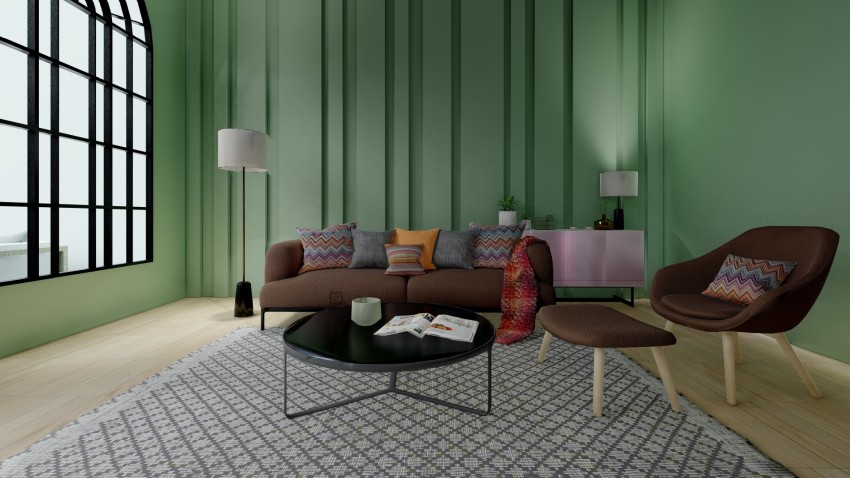
Shades of green are a popular choice for residential interior. The psychology of colors teaches us that a green color imbues a space with tranquility, easing strain on the eyes, and helping to create an atmosphere of relaxation.
Paired with brown, the cool undertones of the green contrast with the warmer undertones of the brown sofa fabric. Lately, paler shades of green like the one in the sample image are considered as an alternative to neutrals, due to the calming nature of the color.
For an otherwise muted color palette in an interior space, I recommend introducing small touches of vibrant color.
In the sample interior, this has been done by incorporating a range of brightly colored and patterned cushion on top of the sofas, while the remaining accents like the center coffee table and the area rug have been maintained in a monochrome palette.
DEEP GREEN
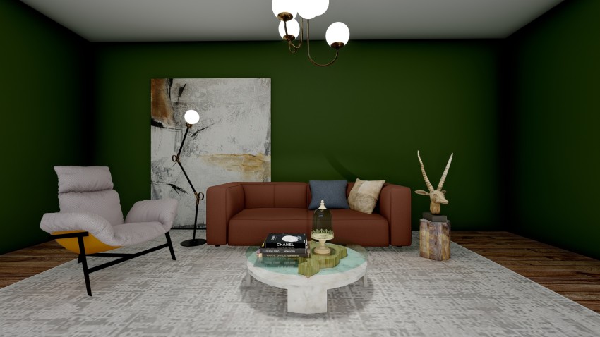
A deep, velvety green color when applied to the walls of a room tends to create an atmosphere of intimacy and warmth, which is ideal for spaces like living rooms where people tend to build familial and communal connections.
By pairing a deep green backdrop with furniture upholstered in brown fabric, you can hope to multiply that cozy sense of warmth. To provide a contrast to the principal color scheme, you can incorporate a statement piece in a different color tone, for instance the single chair in a tan fabric color.
I recommend introducing a grounding element to provide a visual break by providing contrast. In the sample interior, this has been accomplished by incorporating a beige area rug that seems to reflect the color of the ceiling and ground the interior décor within these two planes.
DENIM BLUE
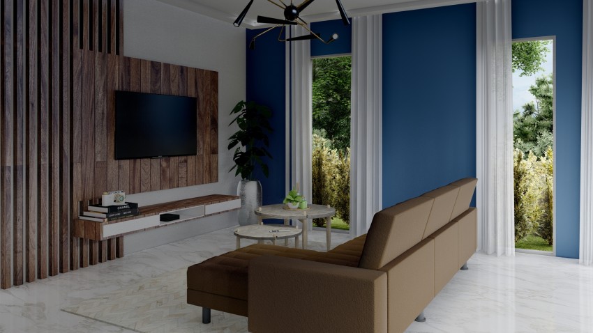
Blue, in all its shades and hues, adds a touch of calming stability to any interior it is applied in. Looking at the color wheel alone, it is one of the best colors to pair with brown furniture, due to the stark contrast between the two.
The cool undertones of the blue walls will contrast with the warmer undertones of the brown furniture. Each adds to a space what the other lacks: the serenity of the blue, and the warm comfort of the brown.
In the sample image, the blue color has been restricted to one wall of the room. By limiting the use of color to one plane, you can create a focal wall that provides a guiding element to then organize your furniture and décor around.
I recommend adding a white color to act as a neutral in the color palette of this interior. As in the sample interior, this can be done in the marble finish of the floor, the sheer white curtains adorning the windows and the hints of white in the furniture planes.
GRAY
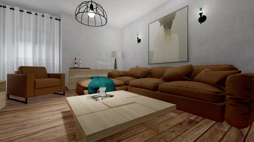
While an unconventional choice when pairing colors with brown, gray can be the ideal option for curating a certain kind of interior design. The colors of gray and brown, used in certain ways, can create an industrial vibe for your design scheme.
A gray color, when applied to the walls in the form of a textured concrete finish, provides a roughness that is complemented by the soft fabric of the sofa upholstery, as in the sample interior above.
To complement the overarching color palette and in keeping with the design language, I recommend incorporating furniture and fixtures that utilize black painted metal. This will help to consolidate the industrial design scheme into a cohesive whole.
By adding small touches of color, you can create points of visual focus to direct the eye across the space. You can do this through décor, such as the vibrant teal sofa throw in the sample image.
BRICK RED
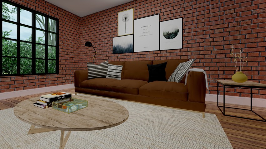
An application of red brick on interior walls gives the appearance of a rustic, and almost nostalgic interior.
The textured finish of the brick leaves room for minor imperfections and irregularities which only multiplies the charm of the material. With time, the brick displays the wear of ages on its surface proudly, adding to the distinct beauty of the material itself.
Paired with brown furniture, the overall effect is of an interior space that exudes rustic warmth, inviting the inhabitants to find comfort within its walls. The muted nature of both the colors ensures that the atmosphere created is one that promotes feeling of relaxation, ideal for a residential interior.
With a homogenous color and material palette of red brick paired with brown, I recommend introducing a contrasting secondary palette for the accent decorative elements.
In the sample interior, I have done this with a monochrome palette, as seen in the framed prints, the patterned cushions, and standing lamp and the window framing.
As an alternative, you can use this palette to incorporate a complementary color, like ochre yellow or magenta, to add a touch of vibrancy to the overall interior.
Related Posts
- Best Sliding Door Types and Brands According to Reddit Users
- Sliding Patio Doors vs. French Doors: Choosing the Best Option for Your Home
- How to Protect Sliding Glass Doors from Burglars: Essential Security Tips
- How Long Do Sliding Glass Doors Last? Durability and Lifespan Explained
- Here Are Some Pros and Cons of Textured Walls in Homes
- Why Do Sliding Doors Get Stuck? Common Causes and Solutions
Leave a Reply