Recent trends have shown a tendency to incorporate color into spaces for the vitality and vibrancy they bring. Popular colors of choice range from everything from bright, sunny yellows, to deep, velvety teals. But few can match the luxurious pop of color that burgundy adds to a space.
Being a mixture of purple and red, burgundy is not a color that can be sidelined or sequestered out of sight.
It is a color that demands attention, that steals the limelight for itself, and emerges as the star of whatever interior space it inhabits.
The intensity of the color also allows it to be paired well with any number of colors, from soothing neutrals, to pastels, to deep jewel tones, everything serves as a complementing background for burgundy to stand out against.
You may think of it as a challenging color to work with, after all, how can such a dominating color ever create a balanced interior décor scheme?
On the contrary, this color has the rare charm of merging seamlessly into any palette it is including in, and it complements by virtue of the very contrast it creates.
In this article we’ll showcase some original designs of various colors that go well with burgundy, so let’s discuss these designs below.
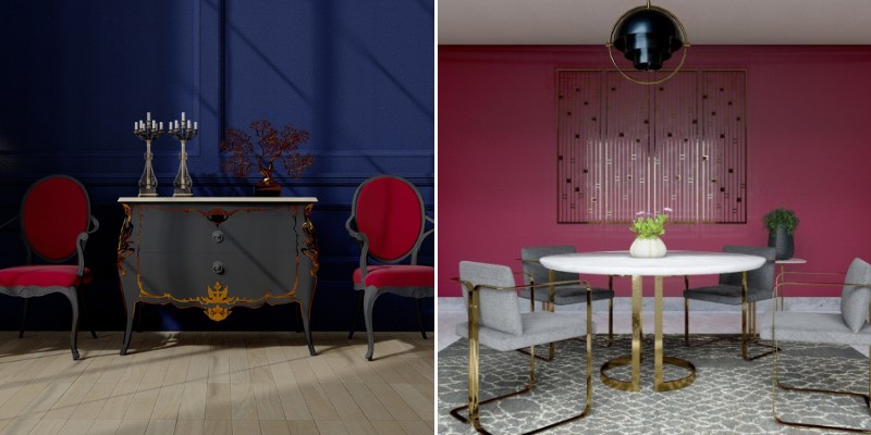
Burgundy and midnight blue
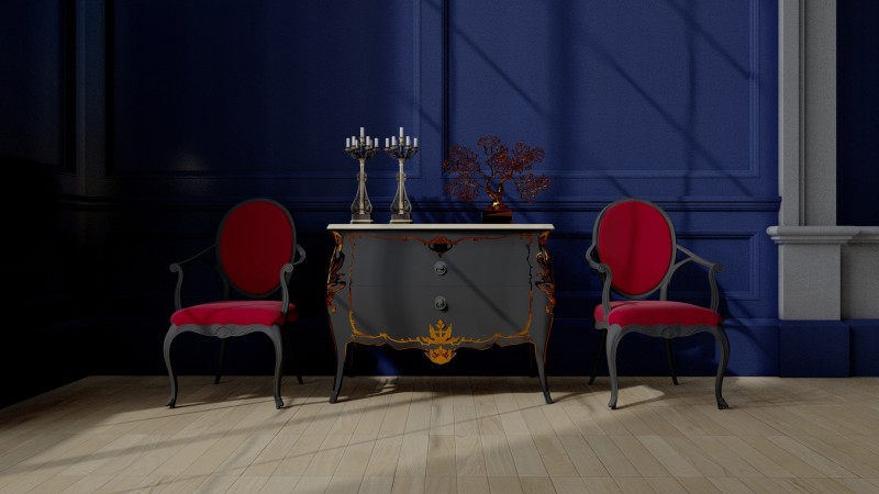
A combination of two rich colors like burgundy and midnight blue imbues your interior space with a sense of luxury and opulence.
A space enclosed in midnight blue walls gives the appearance of coziness, shrinking the expanse of the space to create an atmosphere of intimacy.
I recommend including accents of gold and bronze. The metallic surfaces of these materials will pick up the light available in space and create spots of light in an otherwise darker themed interior. This color combination is ideally suited for a more classic, opulent aesthetic.
In the sample image, you can see how the velvety burgundy fabric of the chair upholstery has a warmer undertone, which provides a contrast to the cooler undertones to the blue of the walls. The contrast thus created balances the colors in your space.
Burgundy and dark green
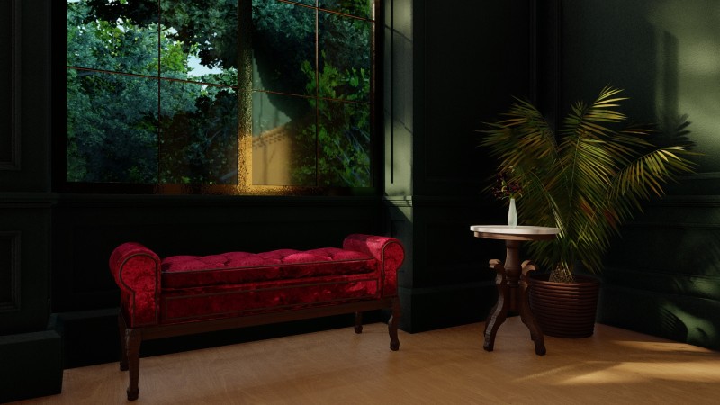
A dark leafy green is a color intimately connected with the natural world. It harkens back to the colors and textures found in the depths of nature, from forests to underwater depths.
Due in part to these associations, it evokes feelings of tranquility in the inhabitants of a space.
By setting burgundy accents against a leafy green backdrop, the vibrancy of the former is highlighted and thrown into sharp relief, much like the blooming flower of a plant would.
This creates a figure/ground relationship between the two colors and defines a sense of hierarchy, creating a visual narrative in the space.
In the sample image, the large window allows dappled sunlight to filter into the space, the resulting play of light and shadow adding depth and character to the interior.
The incoming light also highlights the velvety sheen of the burgundy fabric, further cementing it as the focal point of your space.
Burgundy and gray
A pale gray painted finish for the interior walls creates a neutral backdrop, itself receding into the background and surrendering the foreground for other colors and accents to shine against it.
A focal feature in burgundy, like the chairs in the sample interior above, stands out in the interior space, with no competing colors and textures to create visual clutter around the space.
The contrast between the paleness of the gray and the brightness of burgundy contrast against each other.
Additional features like indoor plants and woven rugs soften the vibrance of the burgundy, and add some hints of natural textures around the space.
To make the space appear more expansive, allow natural light to infiltrate the space. The influx of light brightens the space, and keeps the gray of the walls from appearing too dreary.
Burgundy and pale blue
A color like burgundy adds so much vitality to a space and imbues a space with life. To keep the space from seeming overly stimulating, a softer color like pale blue can be added to an interior to create a balance of moods. The vibrance of one is softened by the calmness of the second.
Burgundy and blue are complementary colors, as they lay opposite each other on the color wheel. The contrast between the two accentuates their pair as complementary color, as each one adds something unique to the space.
I recommend introducing patterns to create a visual break between the two colors. In the sample image, this purpose is served by the monochrome patterned couch, and the chevron patterned rug.
Burgundy and cream
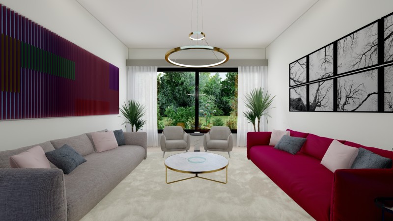
In the palette of neutral colors available to us, cream is one of the most versatile of them all. It pairs well with any color across the spectrum, creating a grounding presence for a bright color like burgundy to be highlighted against it.
In the palette of whites, cream is a color that adds a touch of class and sophistication to a space. The subtle hint of warmth of this shade, imbues the spaces with a coziness that reduces visual stimuli, creating a relaxing interior atmosphere.
The neutrality of the wall color creates space for accent art to be placed upon it. I recommend balancing the use of color across the space to create an overall harmony of design.
In the sample image, the art above the burgundy sofa is maintained in a monochrome palette. While the wall opposite is adorned with a much more colorful display.
Burgundy and pistachio green
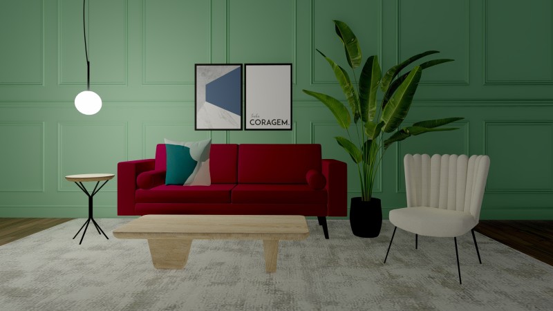
A pale green color like the one shown here has emerged as a popular choice for use in interior spaces. The muted color adds a touch of serenity to a space, with green colors known for the feelings of tranquility and calmness that they add to a space.
A contrasting color, like burgundy, when set against a pistachio green backdrop, stands out in sharp focus. It creates a visual hierarchy, with the burgundy couch being the dominant feature that draws visual focus towards it.
I recommend adding features like statement lights and indoor plants to add complementary décor to your interior space. This will help your interior design scheme to come together as a cohesive whole.
Burgundy and charcoal
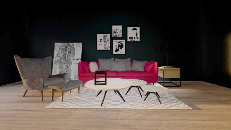
A dark color like charcoal gray may seem like an unconventional choice for use in an interior, but with the wall surfaces in a darker finish, like in the sample image above, can simulate a feeling of coziness and intimacy in a space.
Against a dark charcoal backdrop, the burgundy finish of the couch stands out as a bright and lively addition. Moreover, a dark interior space allows you to play with light placement to bring certain spaces into focus while allowing others to recede into the background.
I recommend using the placement of white wisely, to create islands of light against a darker backdrop. In the sample image, the frames placed behind the sofa, the white tabletops, and the white canvas print leaning against the wall are all spots of brightness creating a balanced space.
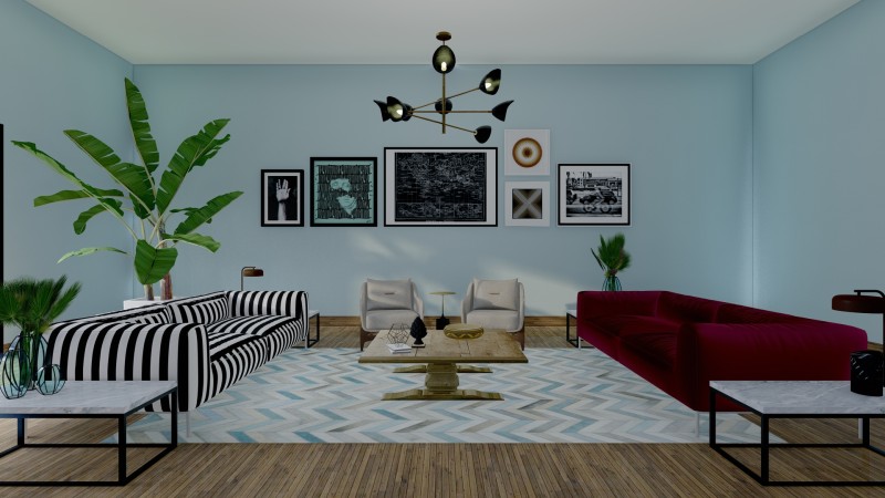
Burgundy and gold
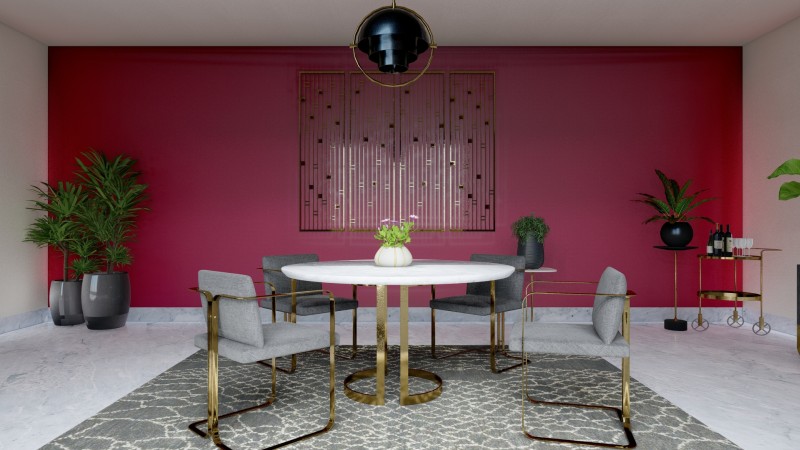
A burgundy backdrop, in the form of a painted wall finish, created a focal wall by defining the passage of visual focus in a space. The wall surface highlighted thus automatically becomes the surface around which all furniture is oriented.
Metallic gold accents will add a complementary accent feature. Where the burgundy color will absorb light, the gold finishes will reflect it.
Adding wall art in metallic finishes like gold or bronze will create a play of light across surfaces, also helping to add a touch of sophistication to an interior space.
I recommend extending the use of gold accents across the interior space, instead of limiting it to the wall art alone. In the sample image, touches of gold can be seen in the ceiling light fixture, the frames of the furniture, and the decorative accents in the room.
This cements the presence of gold in the décor scheme as an integral part of the material palette, and not as an isolated alien presence in the room.
Related Posts
- Best Sliding Door Types and Brands According to Reddit Users
- Sliding Patio Doors vs. French Doors: Choosing the Best Option for Your Home
- How to Protect Sliding Glass Doors from Burglars: Essential Security Tips
- How Long Do Sliding Glass Doors Last? Durability and Lifespan Explained
- Here Are Some Pros and Cons of Textured Walls in Homes
- Why Do Sliding Doors Get Stuck? Common Causes and Solutions
Leave a Reply