Hardwood floors have always remained a popular and well-loved choice of material for floor finishes.
The texture and natural wood color, polished to perfection, adds a timeless charm to any interior space.
The longevity, and durability under constant wear that hardwood flooring has demonstrated has cemented it as one of the most reliable options for a flooring material.
To complement the finish of the wooden flooring, it can be a daunting task to select colors and finishes for furniture and upholstery.
This guide aims to demonstrate a number of color options that can be paired with hardwood flooring to result in a pleasant and harmonious interior design scheme.
Organic textures like wood can work well with a wide range of colors, to achieve different outcomes for spaces.
For instance, warmer colors would create a different atmosphere as compared to cooler colors.
To help you along your interior design journey, the article below will aid in your search for the perfect furniture color ideas for hardwood floors.
MAGENTA
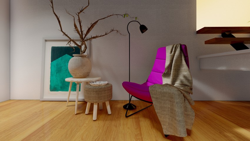
A vibrant color like magenta adds a certain liveliness to any interior space. Set against a polished hardwood floor, the magenta upholstery of your furniture will stand out as a focal feature, drawing the bulk of the visual attention towards itself.
Vibrant colors tend to have a stimulating effect. In order to create a balance of colors, you can introduce a contrasting color to provide some visual relief and prevent the space from appearing too chaotic.
In the sample image, a contemporary chair upholstered in magenta fabric is complemented by a contemporary framed print in shades of teal.
I recommend adding accents in neutral tones of beige to allow the contrasting color palette to emerge as the highlight of your interior scheme.
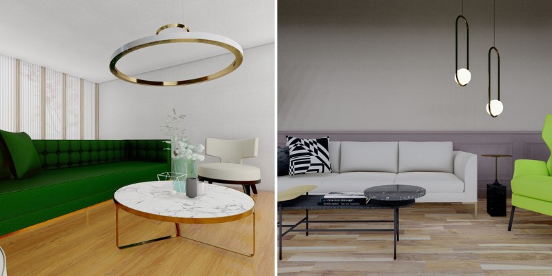
FOREST GREEN
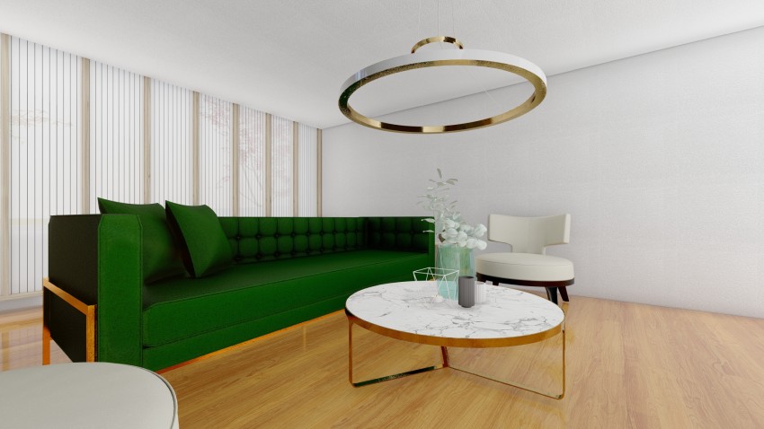
While an indoor space acts as a sanctuary, providing barriers that protect its inhabitants from the effects of the natural world, it is necessary to realize the importance that communion with nature can have on a person’s well-being.
A hardwood floor has the charm of an organic appearance, introducing a natural touch to an otherwise artificially enclosed space. To accentuate this look, a hardwood floor can be paired with a deep, forest green color in furniture.
The undertones of the natural wood color, and those of the green upholstery fabric provide a pleasant contrast of dark and light.
I recommend introducing accents of metallic bronze in your furniture to add a luxe finish. The reflective surface will automatically distribute hints of the green color throughout the space.
CREAM
For a classic and minimalist interior design scheme, a neutral color like cream can be introduced into your space to complement a hardwood floor finish. A cream color, hailing from a family of whites, adds a sense of sophistication to the interior.
The soft warm undertones of a cream color, complement the finish of the hardwood floors by adding a feature that acts as a neutralizing element.
The understated appearance of a cream-colored couch does not detract from the rich warmth of the polished wood floor, allowing it to retain its position as the star of the space.
By keeping the color scheme restricted to a neutral palette of cream and black with touches of natural accents like wood and jute, the overall space can be curated in a minimal and modern aesthetic.
ROSE TAUPE
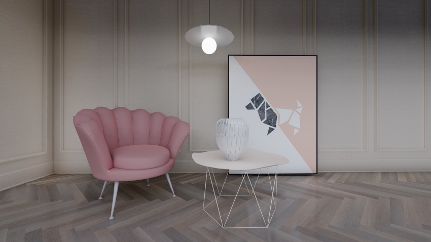
For a soft, feminine touch, a color like rose taupe adds a gentle hint of color to any interior space. Paired with a hardwood floor, the muted color of the furniture fabric adds a touch of delicate sophistication.
A rose taupe color combines a sense of vitality and liveliness with a muted and somber sense of elegance. The result is an influx of color that is understated in its influence on the overall scheme of the interior.
Such a color is especially suited to a more contemporary aesthetic. I recommend leaning towards furniture, accents, and lighting fixtures that reflect such a sensibility.
In the sample image, the overall effect is that of a contemporary design aesthetic set against a more classic backdrop.
WHITE MARBLE
In terms of furniture finishes to pair with hardwood flooring, a material like white marble is an interesting choice, in the contrast it offers between the two.
Marble and wood contrast with each other not just in terms of color, but also in the sense of the atmosphere they tend to create, their undertones, their finishes, and their associations.
Where one is organic, the other appears synthetic. Where one adds warmth and intimacy, the other creates a sense of coolness, thus balancing the overall undertones in a space.
A surface finished in white marble also tends to be glossy and highly reflective. The white color also helps to denote it as a standout element against the hardwood floor.
I recommend orienting a lighting fixture so that it highlights the materiality of the marble in all its glory.
LIME GREEN
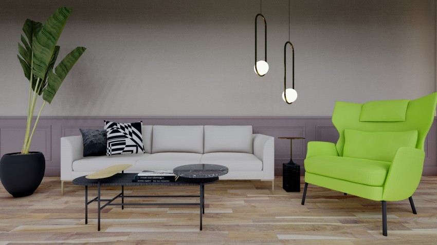
Against a muted and neutral backdrop consisting of a natural color palette of beige, white and the like, a pop of color adds vitality and liveliness to an interior space.
A bright neon shade like lime green seems to almost glow amidst the otherwise understated design scheme of the interior.
The contrast between the finish of the wooden floor and the neon color of the furniture will create a sharp contrast and add an eclectic touch to your interior space.
To maintain a balanced color scheme, create a focal element in a lime green color and maintain the remaining furniture pieces in a palette of neutral color tones like black, white and beige.
I recommend situating a lighting fixture above or near the aforementioned lime green focal piece, to further accentuate it using light as a design element.
DUCK EGG BLUE
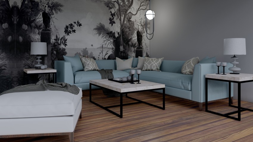
A soft, muted shade of blue will complement the polished hardwood floor of your interior space by presenting a cool, soothing influence to balance out the warmth contributed to the space by the hardwood floors.
According to color psychology, shades of blue help to create atmospheres that are calm and soothing. In comparison to warmer color tones, a blue color helps the eyes to relax, and promotes relaxation.
Duck egg is a muted, desaturated shade of gray-blue, that creates an atmosphere of calm sophistication.
To maintain this aesthetic, i recommend restricting the color palette of the interior space to a grayscale spectrum, with touches of black to add stability and depth.
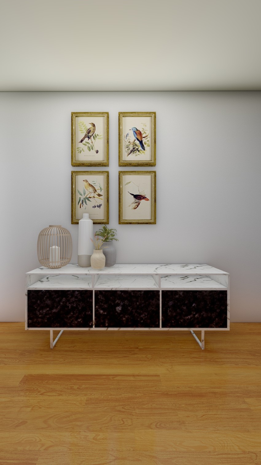
BEIGE RATTAN
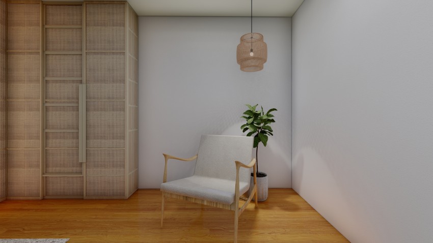
A natural and organic finish like a hardwood floor can be ideally paired with colors and materials that have similar characteristics.
Materials with a natural, textured finish like jute, or rattan weaves, complement the wooden finish of the floors and create a cohesive design scheme.
A rattan weave in a beige color is the perfect complement both in terms of color, as well as materiality.
Both materials are reminiscent of texture found in nature, and this sense of connectivity with the natural world is their biggest contribution to an interior space.
To accentuate the natural accents in the dominant color palette, I recommend introducing an indoor plant into your space.
A leafy green color provides some visual respite from the otherwise monotonous color scheme, while the plants imbue the interior space with its vitality.
Related Posts
- Best Sliding Door Types and Brands According to Reddit Users
- Sliding Patio Doors vs. French Doors: Choosing the Best Option for Your Home
- How to Protect Sliding Glass Doors from Burglars: Essential Security Tips
- How Long Do Sliding Glass Doors Last? Durability and Lifespan Explained
- Here Are Some Pros and Cons of Textured Walls in Homes
- Why Do Sliding Doors Get Stuck? Common Causes and Solutions
Leave a Reply